A website’s credibility is highly dependent on how valuable the users find it. It is a fact backed by several statistics. One such statistic observes that around 75% of consumers admit that they judge a company’s credibility based on its website design.
For example, have you ever visited the website of your favourite brand only to find it changed, but not in a good way? It is harder to find the Menu, and the new interface is distracting. This is likely to put off the majority of website visitors. Initially, the users may provide feedback, but if they don’t see it implemented, it is bound to frustrate them. Some may even question the brand’s credibility. They might even consider finding another brand that has a more user-friendly website.
To ensure you – as a business owner – don’t face such problems, we have created a detailed web design best practices checklist. This checklist narrows down the essentials of building a user-friendly website.
Read: Crucial Web Design Statistics To Know This Year
You’ve Finally Found the Right SEO Agency!
Capsicum has the SEO solutions you’ve been searching for. Don’t let another day go by where your competitors are looking down on you! It’s time to be discovered!
Get Started NowBest Web Design Practices For 2022
Set up a Target Audience for the Website

A target audience allows you to focus your sales and marketing tactics on a particular group of people who are likely to visit your website, online store, or blog. Be it a blog or business website, you need to consider the target audience. Narrowing down a target audience can include finding out information such as age, hobbies, lifestyle, job, and income.
Suppose you are designing a website for a local Library. It with automatically narrow down your psychographic to people who enjoy reading. You may want to build a website that influences the viewers to visit the library. For this, you’ll need additional information, such as do people prefer to rent or borrow books instead of purchasing them? This is the kind of information that will help increase your website’s traffic.
Basic Information to collect for the website includes:
- Demographic Information: age, race, gender, marital status, education, employment, income, etc
- Psychographic Information: personality, lifestyle, interest, attitudes, beliefs, opinions, values, etc
Here are a few ways to Identify the target audience for your website:
Begin with your current customers: Suppose you are creating a website for an ‘Afro Hair Products’ Brand. Your current customers are men and women with thick curly and coily hair. That is who you need to target. Make a list, find out the similarities between these customers, and that list includes the characteristics of your target audience.
Target people in need of your services: A product, website, or service is created for a reason. Some build it as a portfolio, while others focus on selling a product or a service. Those who intend to sell should focus on people who need their services or products.
Conduct Customer surveys: Surveys are one of the best methods to learn more about your customers’ psyche. There are several free online survey tools to use. Listed below are four free tools that you can use.
Build a Website that Tells a Genuine Story
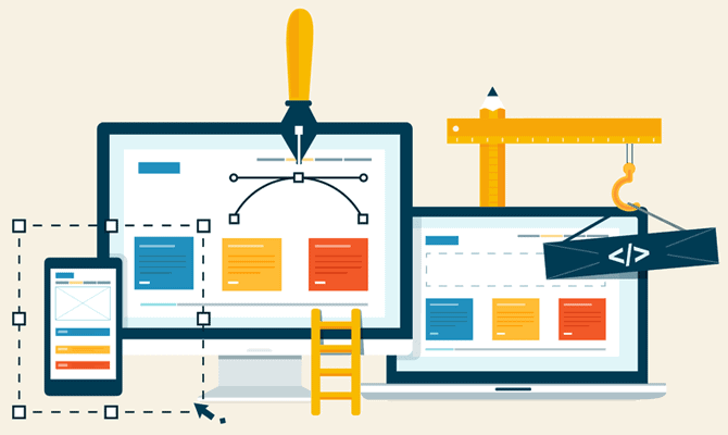
Based on studies conducted by Mark Murphy, people prefer to have their facts and data with a side of storytelling. These studies observed that nearly half of the people would be convinced by facts and data, while the other half wanted to be wooed by a story. When you build a target audience, you’ll gain information to help you decide which way your target audience leans.
Now, let’s talk about the brands that cater to a target audience that prefers authentic storytelling. Although they prefer stories, they also like them to be 100% genuine. It means you may tell them a story as long as it doesn’t lie about what your website services offer.
Here are a few reasons why you should incorporate storytelling in your website:
- Stories deliver a strong emotional message and communicate your values.
- They make it easier to connect with the audience.
- It’s easy to build a story with facts at hand.
- The narrative techniques can help grow your brand.
Establish a Website Theme Guide
What do you consider a website theme?
It isn’t just a simple decorative theme that makes your website look attractive. It is more than that. It is a brand statement that translates across all media, including social platforms and print. Right now, we’ll focus on building a website theme guide. Here are a few guidelines:
Website Style Guide
A step that goes hand in hand with website development planning is to finalize the colour scheme. Believe it or not, people subscribe to colour theory. Therefore, they are conditioned to believe that colours are symbolic. For example, Blue is considered trustworthy and one of the most used branding colours.
A study conducted by Dr Peter Koenig observed the red-green axis as overtly attention-grabbing in a jungle environment. When overused, these colours can be quite distracting. They need to be used with gradients, whitespaces, and lighter colours. Eye-popping colours are more suitable for features such as a call to action button. But colours are just a part of it. There are more factors to consider.
Website Style Factors
- Font Style: Here are the six most used website fonts on the internet: Georgia, Roboto, Helvetica, Playfair Display, Merriweather, and Open Sans.
- Layout and Spacing: These will help you personalize a website while retaining the familiarity craved by users.
- Icon Style: Choose between the styles of the icons such as outline, filled, coloured, and monochrome.
- Image Guidelines: Define a guideline for website images and illustrations based on the colour scheme.
- Website Component design: Website buttons, form elements such as form fields, notifications, navigations menus, and links are another concern. It includes designing their appearance and size. You also have to consider the state of these elements. Let’s consider the button. How does it appear when someone hovers a mouse over it? Does it change colours when one clicks it? States can include: active, hover, regular or focused.
In order to tick these suggestions off your website design checklist, there are a few things that you need to remember. People prefer clean and simple designs, with consistent branding throughout all pages. Also, focus on building an effective layout for every web page.
Create a Clear Call To Action (CTA) Button

The next item on our web design checklist includes Call To Action, which compels website visitors to procure your services. We are sharing effective CTAs of four top-tier brands to give you an idea of what it takes to create an impactful CTA.

Call to action: Cloudflare’s straightforward, Under Attack CTA mirrors the sentiments of the people who visit the websites. So, they are more likely to click on the button than the sign-up button next to it.

Call to action: “Get 3 Months Free”, highlighted in attention-grabbing white font on a black button.
Notice how there are no conditions, just a straightforward 3-month free access to a bounty of music by world-renowned artists. Of course, if the users decide against the service, they can cancel their subscription and delete their account anytime.
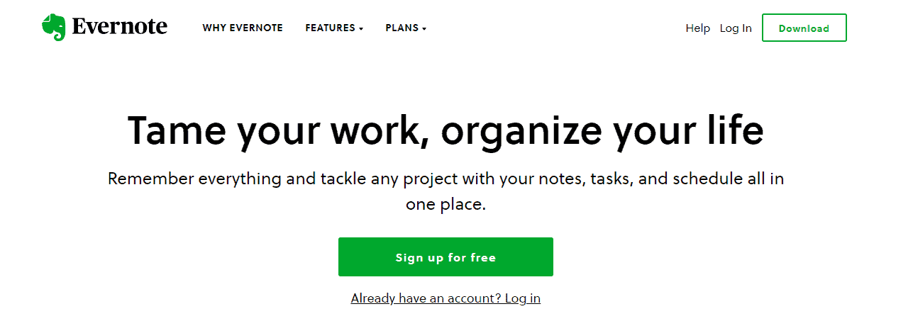
Call to action: “ Sign Up for Free”, on a green button consistent with the website’s theme, yet attention-grabbing. Although Evernote has premium plans, it also offers a feature-rich free plan. The “Sign Up For Free” CTA highlights these services, influencing people to sign up.
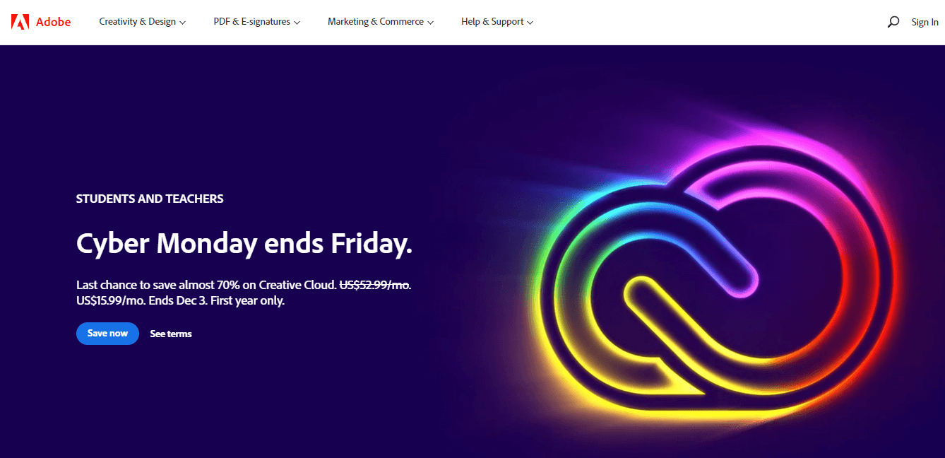
Call to action: Adobe’s clever “Save Now” CTA for the Cyber Monday sale. Shopping events such as Cyber Mondays and Black Fridays allow you to offer your products and services at a discounted price. These events are a perfect opportunity to use the “Save Now” CTA.
Invest in Search Engine Optimization (SEO)

SEO Company in Mumbai, an advanced digital marketing strategy, is known for its persistent growth. Without SEO, you’ll probably have to shell out more money on advertisements (paid ads) until you establish a solid base of loyal customers, and it will take a lot of time. Here are a few more reasons why you need to add SEO to your web design checklist.
Why do you need SEO for your Website?
- Rather than showing your content to people who don’t need it, SEO will attract the target audience who value your website and its products & services.
- SEO can save you the cost of paid ads. If you are serving high-quality and valuable content, Google’s algorithm will consider your content the best result for a query.
- Based on statistics, SEO is more effective than Google ads (PPC). Users prefer organic search results over paid ones.
- With SEO strategies like link building, you can grow the website’s awareness. Furthermore, industry experts stand witness to the improvement in website ranking after implementing SEO.
Listed below are a few SEO techniques that’ll improve your website’s performance.
- Site Audits
- Competitor Analysis
- Keyword Strategy
- Content Strategy
- Content Development
- On-page optimisation
- Off-page optimisation
Create a Intuitive Navigation

According to statistics, around 70% of online businesses fail because of poor user experience. It sheds light on the importance of presenting your users with a fully functional and organised navigation bar. Another statistic emphasises how bad experiences can affect consumers. Due to this factor, around 88% are less likely to return to your website.
Bad experiences include not being able to find what they want. So, if consumers do not find what they want within a few seconds, they are likely to leave, increasing your website’s bounce rate. This is why intuitive navigation should be a part of your website best practices checklist.
Below is a screenshot of BBC.com’s Navigation. BBC is a news giant that needs no introduction. Look at how they have sorted each section clearly. So, suppose someone wants to check out their short videos, the visitors will head over to the Reels tab.

Furthermore, the More option beautifully includes the remaining sections instead of crowding them and disrupting the visibility of all labels.

Optimise Images for Better Performance
Next on our web design best practices checklist, we have website image optimisation, also known as image compression. Based on statistics, compressing your website’s images by 25% can save over 250KB, whereas 10% can save over 1MB space, which lightens the website bulk improving the website loading speed.
Although essential to user experience, high-quality stock images can sometimes act as a roadblock to your website loading speed. You can compress it using free image compression tools such as:
CSS Sprite is another way to compress images. It allows you to navigate through the GIF image and pick the image you want to be displayed.
Read: How To Optimise Images For (Social Sharing) In WordPress
Optimise Your Website for Speed

We have already seen how high-quality images can cause the website to load slow. Let’s take a look at other factors that slow down a website:
- Unnecessary CSS, Javascript, and HTML code
- Unnecessary page redirects
The simplest solution is to minify the code snippets by deleting them. Once you delete the code, it will significantly improve the website loading speed. The page redirects also need to be addressed. The outdated redirects need to be updated, eliminating a chain of unnecessary redirects. Remember that the first five seconds of the website load time is critical and impactful for conversion rates.
Build a Mobile Responsive Website

Why do you need to build a responsive website?
- Around 67.1% of the world’s population owns a mobile phone. (Data Reportal)
- Another statistic from Data Reportal suggests that over 5.2 billion people use mobile phones.
- Around 67.2% of eCommerce traffic comes from mobile phones. (TechJury.net)
- Compared to eCommerce, mobile eCommerce is growing at a faster rate. (Statista)
Today, building a website has become synonymous with a responsive website. Older website themes were created only for desktop viewing and have become dated. So, if you try to run these websites on the phone, they won’t render accurately.
For example, if you try to load a website that is not responsive on a mobile phone browser, it will show misaligned images. What looks great on your desktop will probably go out of the frame in the mobile view. To avoid such problems, stick with modern website designs to give your users an exceptional website experience.
Check out our web design services in Mumbai to know how we can help you build a responsive website.
Design an Accessible Website

Website Accessibility speaks about a website accessible to people who have disabilities and impairments. These disabilities could be motor, visual, speech, auditory, or cognitive. We have added this item to the website best practices checklist because Inclusivity is an essential element in today’s empathic world. Let’s see how it can be done.
How to make your website accessible to everyone?
- Provide Keyboard Navigation: A majority of websites let you move to another text field by pressing the tab buttons on the keyboard. It is one example of making the website better for individuals with visual and motor disabilities. Consider using the Tab key to access links or web buttons. You’ll have to build accessible keyboard navigation with detailed guidelines.
- Consider using contrasting colours: People with visual impairments have a hard time reading if the background doesn’t contrast perfectly. They could get fed up and leave altogether.
Check our web development services in Mumbai page to know how we can help you build a website that is accessible to all.
Build a User-friendly yet Creative Website

We all understand the importance of standing out in this competitive industry, but standing out doesn’t have to mean starting from scratch. We live in a world of constantly changing technology. This rapid growth rate affects the user experience, as with every new update to the site, there is a loss of familiarity.
To use your website, people have to understand it. When they visit a website, they’ll look for familiar things, such as a logo on the top left corner of the website, the navigation bar at the top of the website, and adding a link to a logo to bring the visitor back to the home page. It is something that needs to be preserved. You can always slide in new features one-by-one once they get used to your services.
Offer complete transparency with your policies and pricing packages. People are more likely to trust and contact a website that has both a contact page and pricing packages instead of simply a CTA, popping up everywhere asking them to contact the company. As we have seen, when used appropriately, CTA can do wonders. But not in all cases.
Read: Ingenious Examples of Personal Logos and Branding
Want to Skyrocket Your Online Presence? Connect Now!
Call Us Now on +91 98330 94626 (Sales) or WhatsApp Us or send us an email to hello@capsicum.in to discuss your project further!
- 45+ Strong Member Team.
- 651+ Clients Served Globally.
- 15+ Years of Experience.
- 23+ Int’l Countries Served.
Optimise the Website with Heatmap and A&B Testing
Heatmap and A&B testing are as essential to your website’s success as the air we breathe. We have included these two practices in our website best practices checklist because they will guide you to design a user-centric website.
Heatmap
What is Heatmap? What does it do?
As the name suggests, Heatmap is a tool that shows you the mapping of your websites. It highlights the places where users have clicked the most. It also displays data relevant to scrolling. Furthermore, it allows you insights into the workings of your website, showing you what’s working and what’s not.
HeatMapping Tools
- Mouseflow : The free version includes 500 recordings per month combined with unlimited page views and works for a single website.
- Hotjar : The free version allows for 35 daily sessions and unlimited heatmaps. At 1050 recordings per month, it offers more recordings than Mouseflow.
- Inspectlet : The free subscription offers 2500 records sessions along with A/B test visitors. It also has a margin of 25,000 page views per month.
A/B Testing
What is A/B Testing?
A/B Testing refers to the process of showing two or more versions of the same site to website visitors to get their input, to determine which one creates maximum impact and will drive sales. It is also known as split testing.
A/B testing checks website elements such as headlines, sub-headlines, body, subject lines, design, layout, navigation, forms, CTA, testimonials, and content. There are 4 different types of A/B testing suitable for specific requirements: A/B testing, Split URL testing, Multivariate Testing, and Multipage Testing. You can use tools such as Google Optimize, Omniconvert, Crazyegg, and Ab Tasty.
Benefits of A/B Testing
- It allows you to offer your visitors better user experiences.
- A better user experience leads to better ROI.
- It will also effectively reduce website bounce rate.
- You can work on one modification at a time, no need to create a new website.
Were these website design best practices helpful? Let us know in the comment below!


